Every business generates massive amounts of data, but raw numbers don’t tell the full story. Information visualization helps transform this data into easy-to-understand visuals, allowing companies to uncover hidden inefficiencies and reduce operational costs.
Whether it’s tracking real-time expenses, optimizing inventory, or identifying wasteful spending, data visualization enhances decision-making precision. By using clear dashboards and interactive reports, businesses can take action faster and allocate resources more effectively. This blog explores why visualizing data is a game-changer for cost reduction and business growth.
Information Visualization: An Introduction to Cost Reduction
 What Is Information Visualization and Why Does It Matter?
Imagine sifting through thousands of rows of a spreadsheet. Overwhelming, right? Indeed, this is an area where information visualization comes in handy.
It converts bulk data into clear, visual formats like charts, graphs, and dashboards, aiding in the spotting of patterns, trends, and insights over hours of numbers-crunching. What the businesses have received in intuitive information may enable them to arrive at intelligent business decisions.
These can include the control of sales performances, inventory levels, or the analysis of consumer behavior, to name some instances. In a fast-paced world, organizations with the application of data visualization adeptly combine sustainment and a competitive advantage to deliver more efficiency and correctness of decision-making.
How Does Information Visualization Help Cut Operational Costs?
The lack of a clear view of where their money is going can easily result in overruns in the operational costs of businesses. Information visualization saves costs by determining, at a glance, areas where inefficiencies are visible.
For example, a real-time dashboard can show management areas of excessive spending, the existence of a bottleneck in the supply chain, or underperforming assets in one visual. Instant clarity on financial waste and areas for improvement is supplied to decision-makers, rather than having them depend on guesswork.
Interactive visualizations enhance team collaboration, reducing communication problems and speeding up the problem-solving cycle. When everybody is on the same page, there's no room for delays, double tasks, or poor planning that usually results in overspending.
This, consequently, leads to the smooth running of operations, appropriate resource allocations, and enhanced profitability.
Key Components of Effective Information Visualization
Not all visualizations are created equal. A good information visualization system should be:
- Easy to understand: data should be displayed systematically, never cluttered.
- Interactive: Users have to have the ability to filter, zoom, and customize views for appropriate conclusions from their newer insights.
- Real-time: The most effective dashboards update automatically, ensuring decisions are based on the latest data.
- Integrated with business systems: Seamless connectivity with existing tools ensures a smoother workflow.
- Scalable: As businesses grow, their visualization systems should be able to handle increasing data loads without slowing down.
By implementing effective information visualization, businesses can not only streamline operations but also create a more data-driven, cost-efficient environment.
The Information Visualization Process for Business Efficiency
Turning raw data into clear, actionable insights boosts efficiency and decision-making.
 Steps to Implement an Effective Visualization Strategy
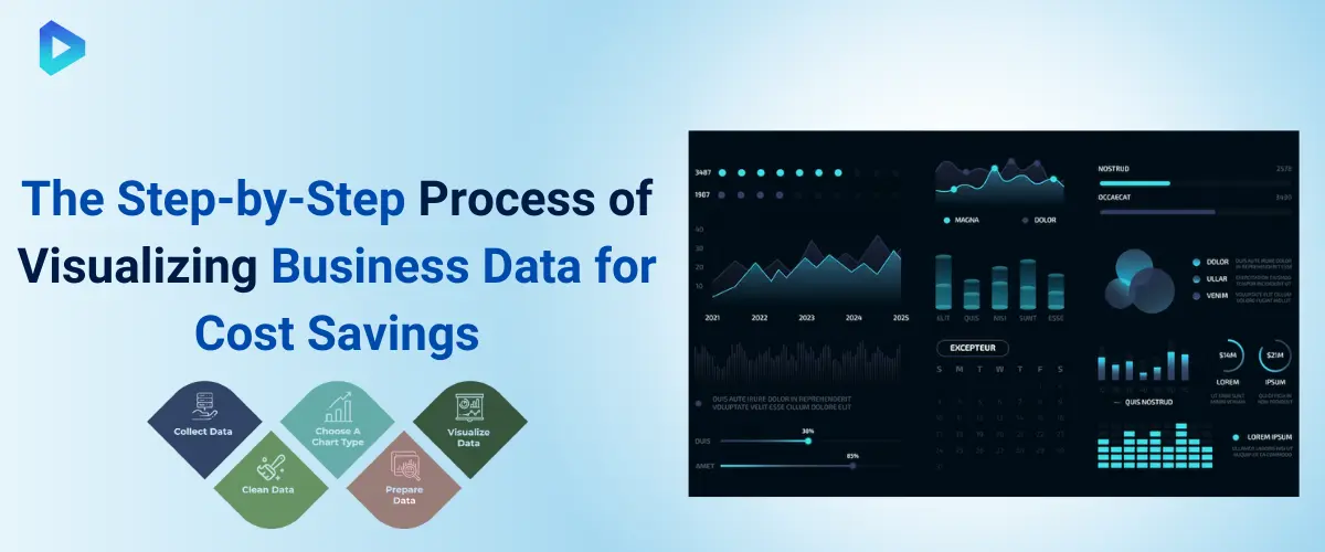
The implementation of the strategy is largely shaped by the business goals. Start by identifying crucial data that will drive decision-making. Without clear objectives, there is a risk of visualization becoming unwieldy and ineffective.
Having set down the objectives, the next step is the selection of the right visualization type. Whether one opts for a bar chart, heatmap, or an interactive dashboard, the format must correspond to the data's intent or purpose. The choice of the right tools- Tableau, Power BI, Google Data Studio, etc.-makes this even easier.
Best Practices for Streamlining Data Interpretation
While effective information visualization may focus more on creating graphs, the end goal is to ease the understanding and actionability of information. Under these circumstances, simplicity comes to the fore. A complex visualization with excessive details makes the expanding trends more confusing than helpful.
Color coding serves as a simple yet strong tool to illustrate trends. For instance, red can represent a decline and green for an increase in performance, which allows an easy identification of performance changes at a glance. Labels/annotations should be made simple and easy to avoid chance misinterpretation.
Another important practice is real-time data updating. Stale data leads to bad decision-making; consequently, one should embrace automated updates from dashboards to ensure that insights stay relevant and contemporaneous. The more manageable the data is, the faster and more action-ready the teams can be.
Tools That Enhance the Information Visualization Process
If properly applied, this will give a huge push to any organizational interest and ability to infer their data. The following are the most powerful information visualization tools available today:
- Tableau – Best for interactive dashboards and real-time analytics.
- Power BI – Ideal for Microsoft-based environments with seamless data integration.
- Google Data Studio – Free tool great for visualizing Google Analytics and other web data.
- Looker – Provides deep business intelligence with advanced data modeling.
- D3.js – A JavaScript library for creating custom, high-performance data visualizations.
Choosing the right tool depends on business needs, budget, and team expertise. Regardless of the platform, the goal is to turn complex data into meaningful insights that drive action.
Overcoming Information Visualization Challenges in Business
Businesses rely on data visualization, but challenges in clarity and accuracy can hinder decision-making.
 Common Obstacles in Implementing Data Visualization
Making an effective data visualization is nothing like throwing numbers into a chart. Many companies do not understand which way to go when choosing the appropriate visualization.
Although a pie chart may show proportions, it does not analyze the trend over time. The wrong way of visualizing leads to distortion and incorrect judgments.
The second main problem in handling large datasets is information overload. Giving too much information at once causes users' fragmentation, whereas too little leaves them speculating. Finding a good balance is all-important.
Technical impediments also slow down the process of implementation. The company lacks expertise in visualization tools, automation, and integration problems, so it can't fully harness the potential of data visualization.
How to Address Accuracy and Data Interpretation Issues?
Even the best-curated charts are useless if they do not show accurate and meaningful data. It is the responsibility of an organization to have uniform data, meaning verification of sources before they make a visualization.
Conflict about any data in case of separate sources would roll into complete confusion. One suggested solution is indeed real-time data validation.
Data can be validated and automatically identified before it makes its way to the dashboards. This cuts down on errors through early detection. Mapping data onto a dashboard should also avoid misinterpretation through clear labeling and annotation, as well as through interactivity.
Finally, it also gives organizations an edge in avoiding common mistakes in interpretation by training their teams to be data literate. If users are able to read data and infer correctly, better decisions will follow.
Enhancing User Experience with Clear Visual Representations
Data visualization is not just plain number mixing; rather, it involves telling a story. An overloaded, messy dashboard causes great frustration and inefficiency in users. Simplicity and clarity make for great user experiences.
To improve usability, businesses should follow these principles:
- Use minimal colors and avoid visual overload – Overuse of colors leads to dissonance. Thus, the emphasis should be on simple, yet meaningful colors.
- Make visualizations interactive – Allow users to click, filter, and explore data rather than passively viewing static charts.
- Prioritize readability – Use clear labels, avoid jargon, and ensure charts are easy to interpret at a glance.
A well-designed visualization should guide users to insights without requiring them to work too hard to understand the data. The easier it is to interact with, the more effective it will be in driving informed decisions.
Data and Information Visualization for Cost Optimization
Businesses can cut costs and improve efficiency by visualizing data effectively.
 Why Is Data Visualization Essential for Cost Reduction?
Every business decision incurs costs. With no insights, organizations can overspend, waste time, and resources inefficiently.
Here, data visualization saves the day. Armed with visuals on financial trends, operational inefficiencies, and spending patterns, businesses can identify cost-saving opportunities at a glance.
Real-time dashboards can show supply chain costs, inventory levels, and employee productivity. Decision-makers notice inefficiencies at a glance instead of working through spreadsheets, enabling an immediate response.
The important thing is with data visualization, less misunderstanding can occur in reading financial reports, thus empowering teams and executives to make accurate, informed choices in driving profitability.
Transforming Complex Data into Actionable Business Insights
Raw data can often appear perplexing, especially when it comes from multiple sources. Without proper visualization, we stand a wonderful chance of overlooking critical insights hidden under a parade of numbers and stats.
Interactive charts can reveal crucial insights into customer behavior, performance on sales, and operational efficiency. For example, a retail company analyzing its customers' purchasing habits can use visual data to adapt pricing strategies or optimize stock levels for increased sales and reduced wastage.
Well-functioning visualization tools enable businesses to make sense of complex datasets, fast-tracking the process to decision-making with clear insights to contribute to strategic planning and cost optimization.
Reducing Decision-Making Time with Effective Visualization
When it comes to business decision-making, time is money. The longer an analysis takes, the greater the opportunity cost and, hence, the excess expense.
By employing real-time data visualizations, organizations can greatly compress their decision-making periods, thus allowing their managers to ride confidently big waves. An example is a finance team that is monitoring expenditures, which can utilize an interactive dashboard and pick up irregularities in budgets on the fly, rebalancing the allocations where necessary.
Exploring 3D Information Visualization for Better Insights
3D information visualization helps businesses analyze complex data with greater clarity and depth.
 Advantages of 3D Visualization Over Traditional Methods
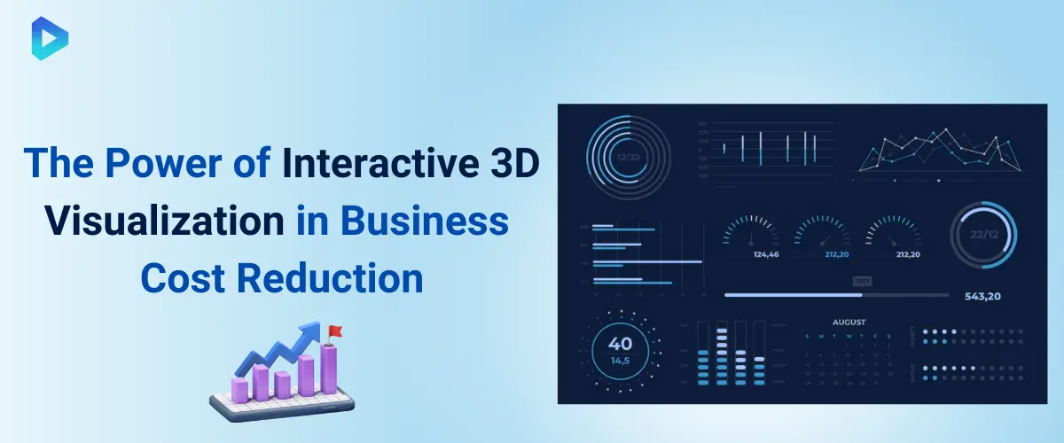
When working with more straightforward datasets, conventional data visualization tools such as bar and pie graphs are able to communicate their messages pretty convincingly. But they disappoint with the more complex, multi-dimensional data. That's where 3D visualization has an edge.
With interactive 3D models, companies can explore patterns, trends, and relationships that would otherwise remain hidden in flat two-dimensional figures. 3D visualization enhances geospatial data, medical imaging, and financial modeling by offering an immersive and detailed view of their respective subject matter.
3D visuals also allow better data storytelling and facilitate the speed at which teams understand, analyze, and act on insights. In turn, this will enable better decisions and savings.
How 3D Visualization Enhances Business Intelligence?
In the present data-driven age, companies rely on BI tools to gain meaningful insights into the matter. 3D visualization takes BI to another level by providing:
- Deeper insights: It can examine complicated datasets from multiple perspectives.
- Improved pattern recognition: Trends and outliers become more apparent in the 3D space.
- Real-time interactivity: The user can zoom, rotate, and analyze the data interactively.
For instance, supply chain managers can map a world-distance supply route with a 3D visualization, while marketing teams can analyze customer interaction in a virtual store. Such capabilities will help an organization become data-driven much faster than its competitor organizations.
Industries Benefiting from 3D Information Visualization
3D data visualization isn't just for tech companies—it’s transforming multiple industries:
- Healthcare: 3D imaging to identify organs and plan surgeries.
- Retail & E-commerce: Companies analyze how customers move in a virtual store.
- Finance: Traders use 3D graphs to uncover market trends and risk factors.
- Manufacturing: Engineers use 3D models to optimize production lines.
- Real Estate & Architecture: Interactive 3D models added to showcase properties even before they are constructed.
By implementing 3D information visualization, businesses across industries gain deeper insights, reduce costs, and enhance strategic planning.
Human-Centered Information Visualization: Issues and Perspectives
Effective data visualization should prioritize user experience, clarity, and cognitive ease for better decision-making.
 The Role of User Experience in Data Interpretation
Information visualization is not only about presenting data—it is about enabling the user to gather insights easily and respond. User-centered designs in visualizations lead the user through the key insights quickly without overwhelming him or her with unnecessary complexity.
When UX is neglected, visualizations can produce confusion, deceit, or actual frustration. For example, proper labeling, color contrast, and interactivity provide the users with the needed tools to derive insight meaningfully and efficiently.
For businesses, a focus on human-centered design in data visualization fosters better decision-making, speedier problem-solving, and conscious strategy development.
Designing Information Visualizations for Better Decision-Making
When effective data visualizations are designed, simplicity and depth must be cautiously balanced. Drawing broad and multicolored sticks can confuse users away from the insights that matter the most.
To design for better decision-making:
- Use the right visualization for the data – Line charts should be used for showing trends, heatmaps for density, and bar charts for comparing.
- Keep it interactive – Users get to drill down to specifics when necessary.
- Ensure accessibility – Colorblind-friendly palettes or readable fonts.
By synchronizing the design of the visualization with the goals of the business and the needs of the users, organizations are better able to improve operational efficiency and optimize strategic decision-making.
Addressing Cognitive Load in Data Visualization Systems
Cognitive load is the mental effort one exerts in understanding and processing information. Overloading a visualization with too much data at one time makes it hard for a user to digest it all at once.
To reduce cognitive load:
- Break the information into easily digestible chunks- show a summary before the detail.
- The use of visual hierarchy- Illustrate the most critical data points first.
- Reduce distractions – there's no need to have excessive animation or extraneous elements.
Such user-centered intuitive data visualization unlocks a fast, confident decision-making process within organizations, thus enhancing organizational productivity and efficiency.


Let's Discuss Your Idea!
Send us your request using the form below.
Contact Info
Our contacts
Thank You!
We will respond to you within 24 hours.